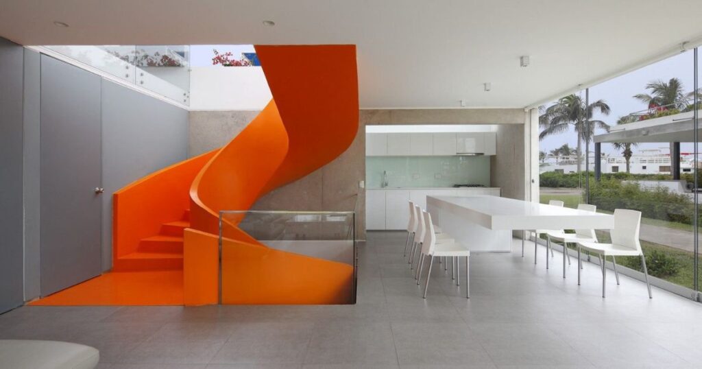
Have you ever walked into a room that instantly took your breath away? Chances are, you’ve experienced the power of emphasis in interior design. This crucial design principle can transform an ordinary space into a captivating haven that leaves a lasting impression. In this comprehensive guide, we’ll dive deep into the world of emphasis, exploring how it shapes our living spaces and influences our emotions.
What is Emphasis in Interior Design?
Emphasis in interior design is the art of drawing attention to specific elements within a space. It’s about creating a focal point that catches the eye and sets the tone for the entire room.
This principle plays a vital role in establishing visual hierarchy, guiding the viewer’s gaze, and creating a sense of balance and harmony.
At its core, emphasis is about:
- Highlighting key features
- Creating visual interest
- Establishing a sense of order
- Evoking specific emotions or responses
When used effectively, emphasis can make a small room feel more spacious, a bland space more exciting, or a cluttered area more organized.
It’s a powerful tool in the designer’s arsenal, working in tandem with other principles like balance, rhythm, and proportion to craft cohesive and striking interiors.
How to Create Emphasis in Interior Design
Creating emphasis isn’t just about making something stand out it’s about doing so in a way that enhances the overall design. Let’s explore four key techniques for achieving emphasis in your spaces.
1️⃣ Emphasis by Color
Color is perhaps the most potent tool for creating emphasis in interior design. A well-chosen hue can instantly draw the eye and set the mood for an entire room.
Here’s how to harness the power of color:
- Use bold accent colors: A vibrant throw pillow on a neutral sofa or a bright accent wall can create instant focus.
- Leverage color psychology: Different colors evoke different emotions. For example, red stimulates energy, while blue promotes calm.
- Create color contrast: Pairing complementary colors (those opposite on the color wheel) can create striking emphasis.
“Color is a power which directly influences the soul.” – Wassily Kandinsky
Pro Tip: When using bold colors for emphasis, limit them to about 10% of the room’s overall color scheme to maintain balance.
2️⃣ Emphasis by Contrast
Contrast is all about juxtaposition placing different elements side by side to highlight their differences. This technique can create dramatic emphasis in interior design:
- Light vs. Dark: A dark piece of furniture against a light wall, or vice versa, naturally draws the eye.
- Textural Contrasts: Pairing rough textures with smooth ones (like a plush rug on a sleek hardwood floor) creates visual and tactile interest.
- Style Mixing: Combining different design styles (such as placing a modern lamp on an antique table) can create intriguing focal points.
3️⃣ Emphasis by Placement
Where you position elements in a room can significantly impact their emphasis. Strategic placement can guide the eye and create a sense of flow:
- Use the Rule of Thirds: Divide your space into a 3×3 grid and place key elements along the lines or at their intersections.
- Create a Triangle: Arrange three elements of varying heights to form a triangle, naturally drawing the eye around the space.
- Center Stage: Placing an item in the center of a room or wall automatically gives it emphasis.
4️⃣ Emphasis by Isolation
Sometimes, the most powerful emphasis comes from what’s not there. Isolation uses negative space to draw attention to a single element:
- Standalone Pieces: A single chair in an otherwise empty corner can become a striking focal point.
- Gallery Walls: A lone artwork on an expansive wall can command attention more than a cluttered arrangement.
- Minimalist Approach: In a room with few furnishings, each piece naturally gains more emphasis.
Examples of Emphasis in Interior Design
Let’s look at some real-world applications of emphasis in interior design:
- The Statement Chandelier: In a minimalist dining room, a large, ornate chandelier becomes the star of the show, drawing the eye upward and adding drama.
- The Accent Wall: A boldly patterned wallpaper on one wall of a bedroom creates a striking backdrop for a simple bed frame.
- The Architectural Highlight: In a home with exposed brick, leaving one wall untreated while painting the others emphasizes the raw texture.
- The Color Pop: In an all-white kitchen, a bright red KitchenAid mixer on the counter becomes an instant focal point.
More Post: Standard Living Room Size: How To Create A Cozy Space?
Bad Emphasis in Interior Design
While emphasis can elevate a space, it can also go wrong. Here are some common mistakes to avoid:
Mistake 1: Overemphasizing Everything
When everything shouts for attention, nothing stands out. This leads to visual chaos and can be overwhelming for occupants and visitors alike.
Solution: Choose one or two key elements to emphasize in each room. Let other elements play supporting roles.
Mistake 2: Lack of Balance and Harmony
Emphasis should enhance the overall design, not clash with it. An emphasized element that doesn’t fit with the room’s style or color scheme can feel jarring.
Solution: Ensure your focal points complement the room’s overall theme and color palette.
Mistake 3: Inconsistent Scale and Proportion
An oversized art piece in a small room or tiny accents in a large space can create awkward emphasis.
Solution: Consider the size of your space when choosing elements to emphasize. Use the golden ratio (1:1.618) as a guide for pleasing proportions.
Mistake 4: Neglecting the Flow of the Room
Poorly placed focal points can interrupt the natural flow of movement through a space.
Solution: Consider traffic patterns when placing emphasized elements. Use them to guide movement, not obstruct it.
Mistake 5: Ignoring Functionality for the Sake of Emphasis
Sometimes, designers get so caught up in creating a striking focal point that they forget about practicality.
Solution: Ensure that emphasized elements serve a purpose beyond just looking good. A beautiful but uncomfortable chair, for instance, might not be the best choice for a living room focal point.
Conclusion
Mastering emphasis in interior design is about more than just creating eye-catching spaces—it’s about crafting environments that resonate with those who inhabit them. By thoughtfully applying color, contrast, placement, and isolation, you can create rooms that not only look stunning but also feel harmonious and functional.
Remember, the key to successful emphasis lies in balance. Too little, and your space may feel bland; too much, and it can become overwhelming. The sweet spot is where your emphasized elements enhance the overall design, guiding the eye and creating a cohesive, memorable space.
As you embark on your next interior design project, consider how you can use emphasis to tell your space’s unique story. Will you use a bold color to energize a room? Or perhaps you’ll let a cherished heirloom take center stage through strategic placement? The possibilities are endless, and the power to create truly unforgettable interiors is in your hands.
Ready to transform your space with the power of emphasis? Share your ideas and experiences in the comments below, or reach out for a free design consultation. Let’s create spaces that don’t just catch the eye—they capture the heart.


